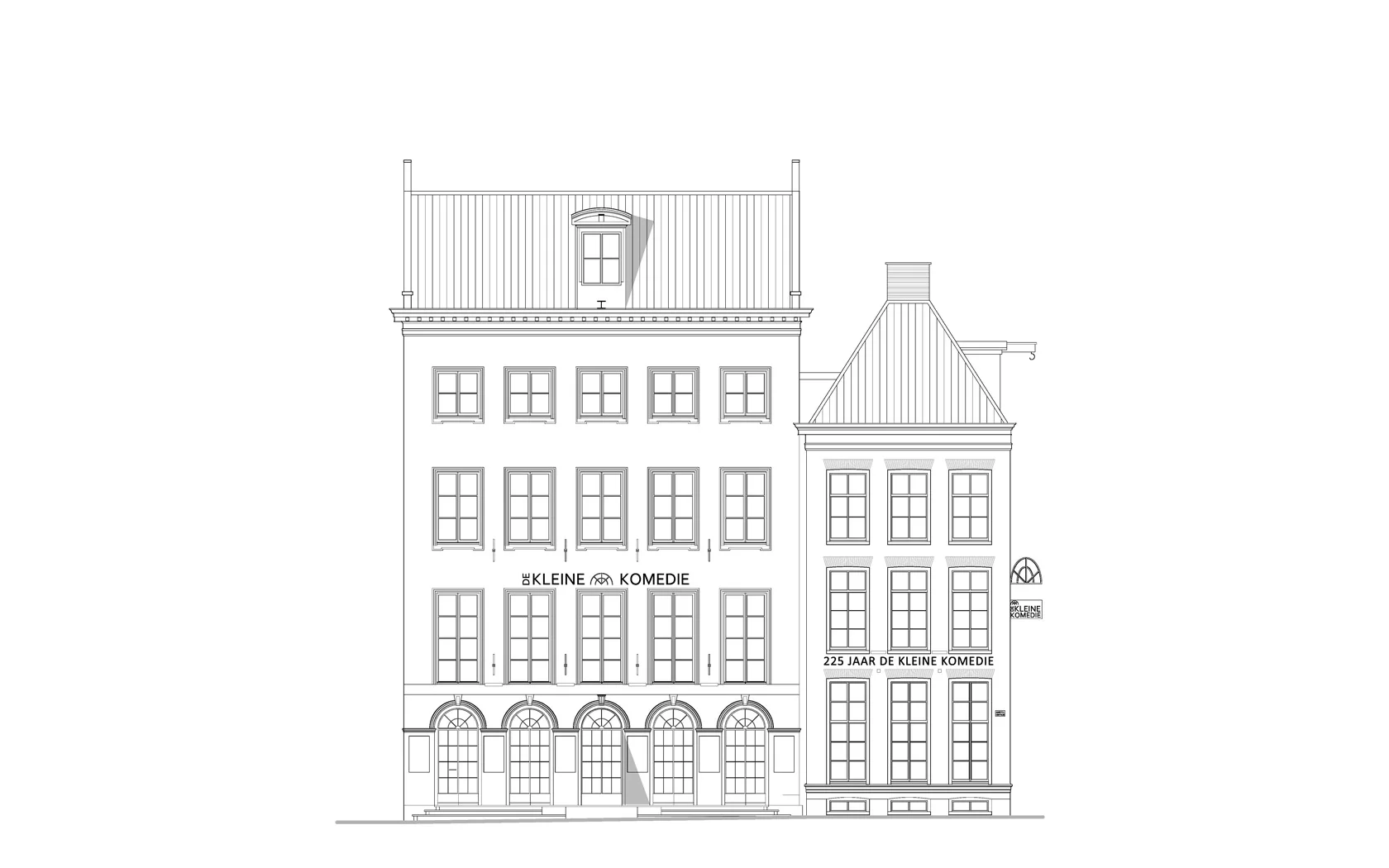
De Kleine Komedie (translates: ‘small comedy’) is situated on the quay of the river Amstel and was built as a French comedy theatre in 1786 by Amsterdam city architect Abraham van der Hart. The main part of the current structure however, dates from 1947, when the decayed building, used as a bicycle parking at the time, was transformed back into a theatre. Since the 1950s there have been several small interventions, suffocating the interior space completely. After a thorough preparation, the building was stripped and restored in an extremely short time span. The monumental building revealed many surprises, but after a few months of pressurized construction work, it reopened the 14th of October with an anniversary show.
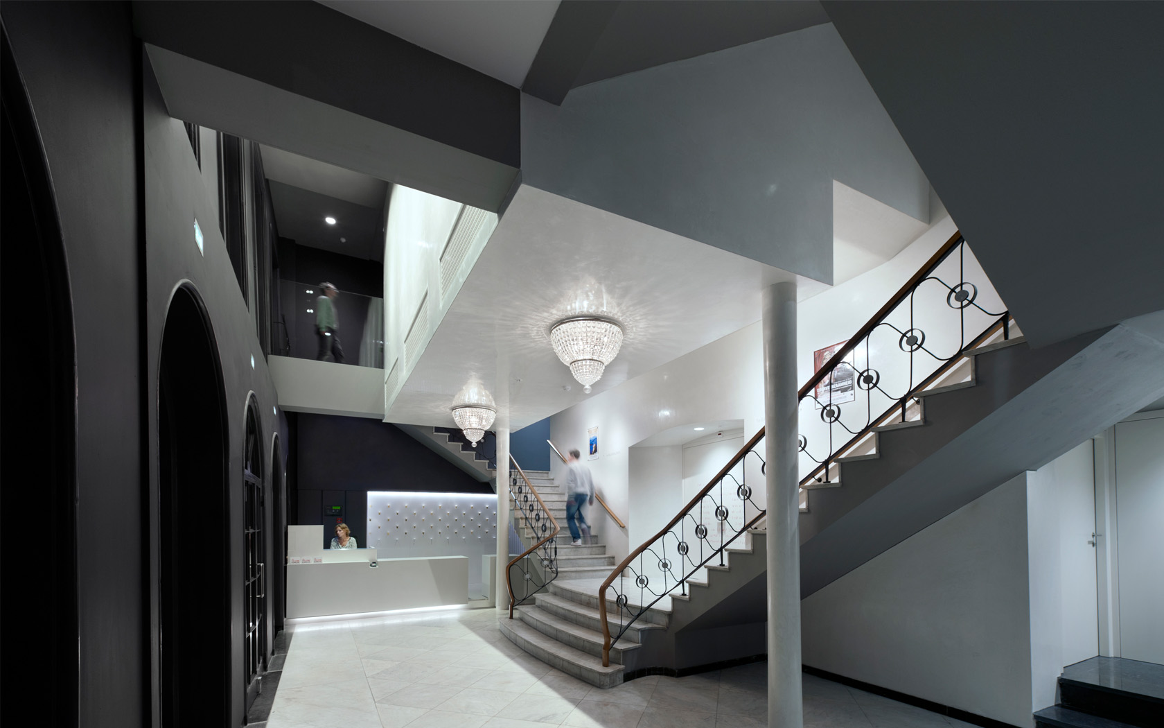
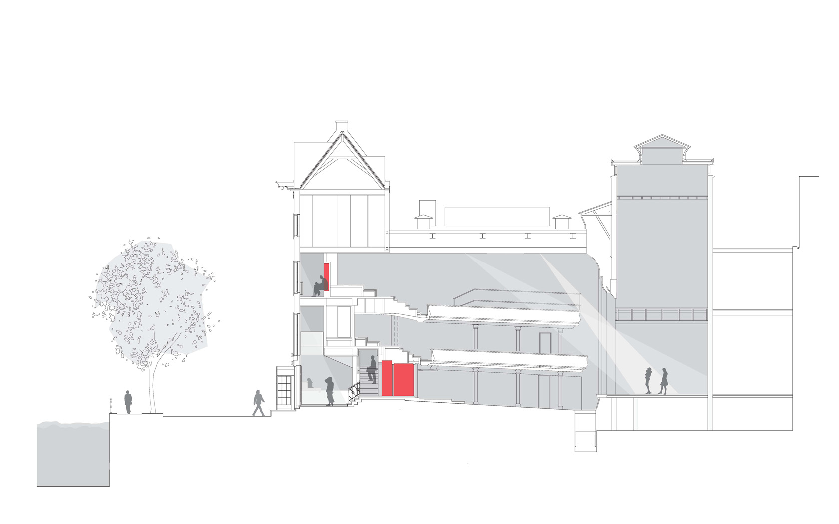
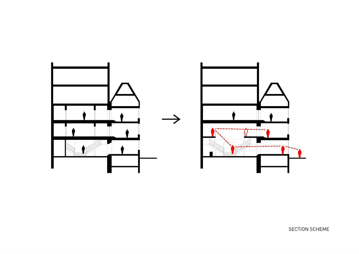
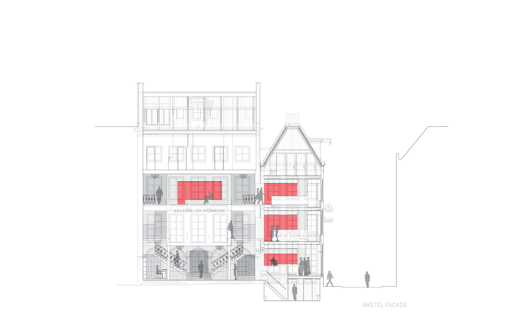
Rethinking the primary functions, public and private routing was splitted to improve convenience in use for the public and staff. Spatially, the small theatre had to become ’larger’ within the limits of the existing state monument. New internal relations are created for the public by creating visual connections between strategic places. A void between the theatre hall and the facade at the first floor provides an open connection between the three different foyers.
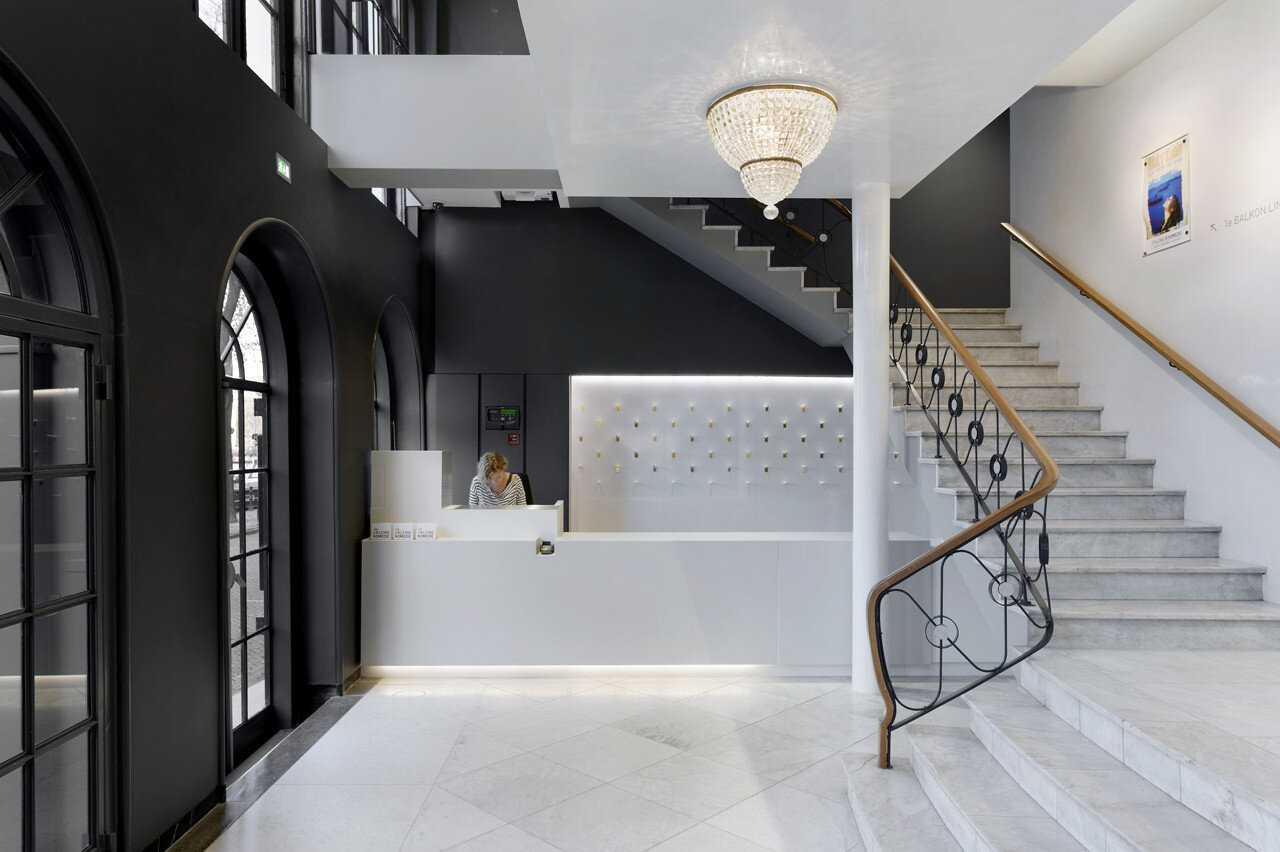
The interior finishings are specifically designed for night use. The skin of the theatre hall is highlighted with a finish of hand-polished white shiny lime plaster according to authentic recipe from the Renaissance. The opposing inner side of the facade has a dark, basalt color. The light is pulled in from the surrounding theatre district around the building, and at the same time the theatrical interior is exposed to the dark streets outside. This reinforces one of the most important roles a theatre has: serving public life. It’s only in a theatre building, where two meanings of the word ‘public’coincide, a spaceto see and to be seen. The small beloved theatre becomes a living room for the city once more.
The use of materials and the detailing of the interior is of high refinement. Old monumental materials and patterns are combined with modern ones, faint finishing is combined with shiny, and soft materials with tough. These contrasts in material finishing are crucial for a theatrical experience. A few examples of the used materials are dark belgian limestone, oak, wool, felt and concrete (bars).
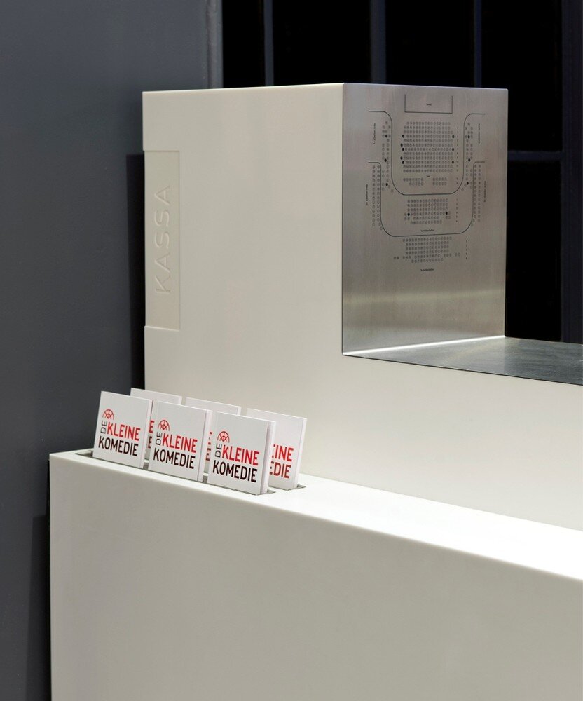
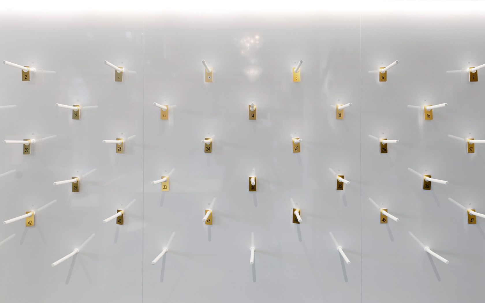
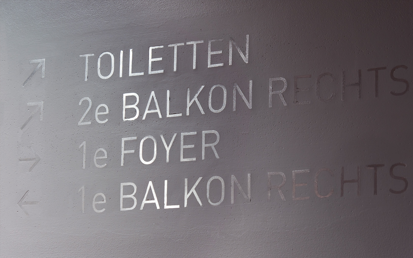
The selected colors are used to direct the eye: bright colors emphasize the bars, seats and doors to the theatre hall. The remaining parts of the small spaces are kept modest in grey tints. The route signing is subtly embedded in the stucco walls. Advertisement, visible installation parts and lighting are all integrated in the finishing surfaces.
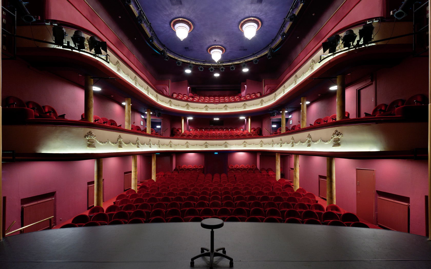
The original theatre hall stayed as it was. The sharp contrast between the old, flamboyant hall and the more humble, modern foyer creates an exciting connection between old and new and will be a home for a new generation of theatre makers and its public.

