“Making the complicated seem simple, is the greatest architectural trick of all.” - Mark Rappolt
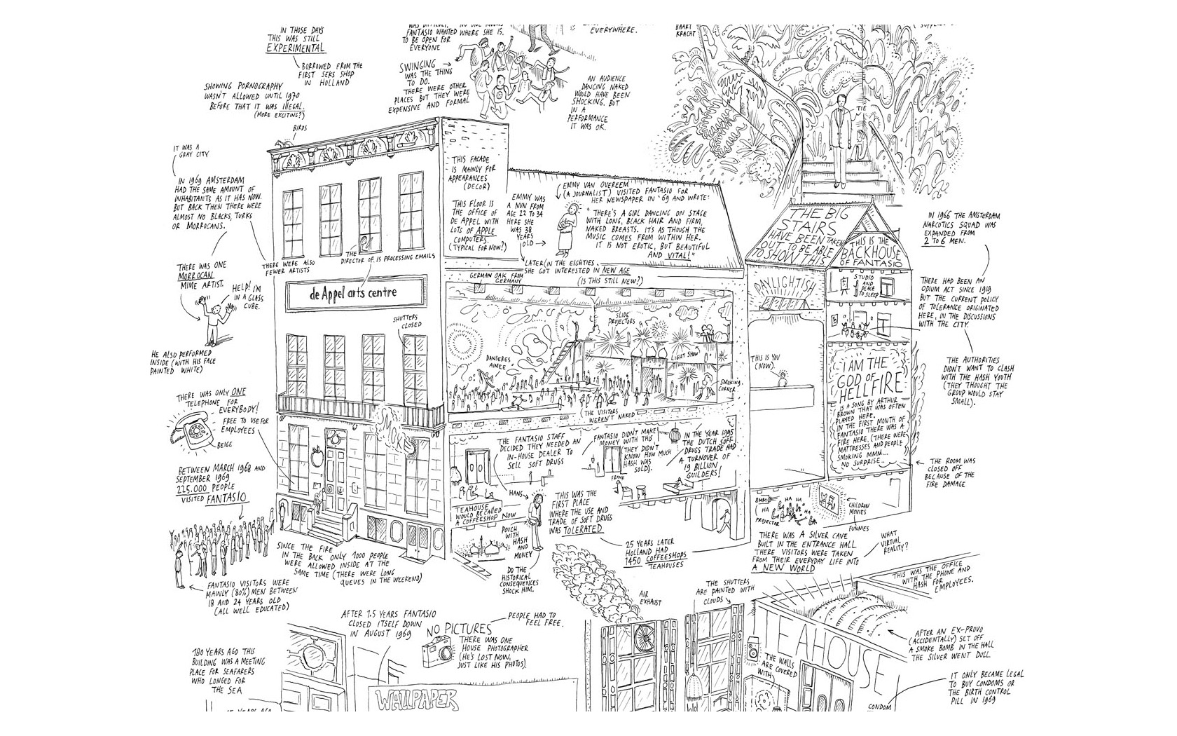
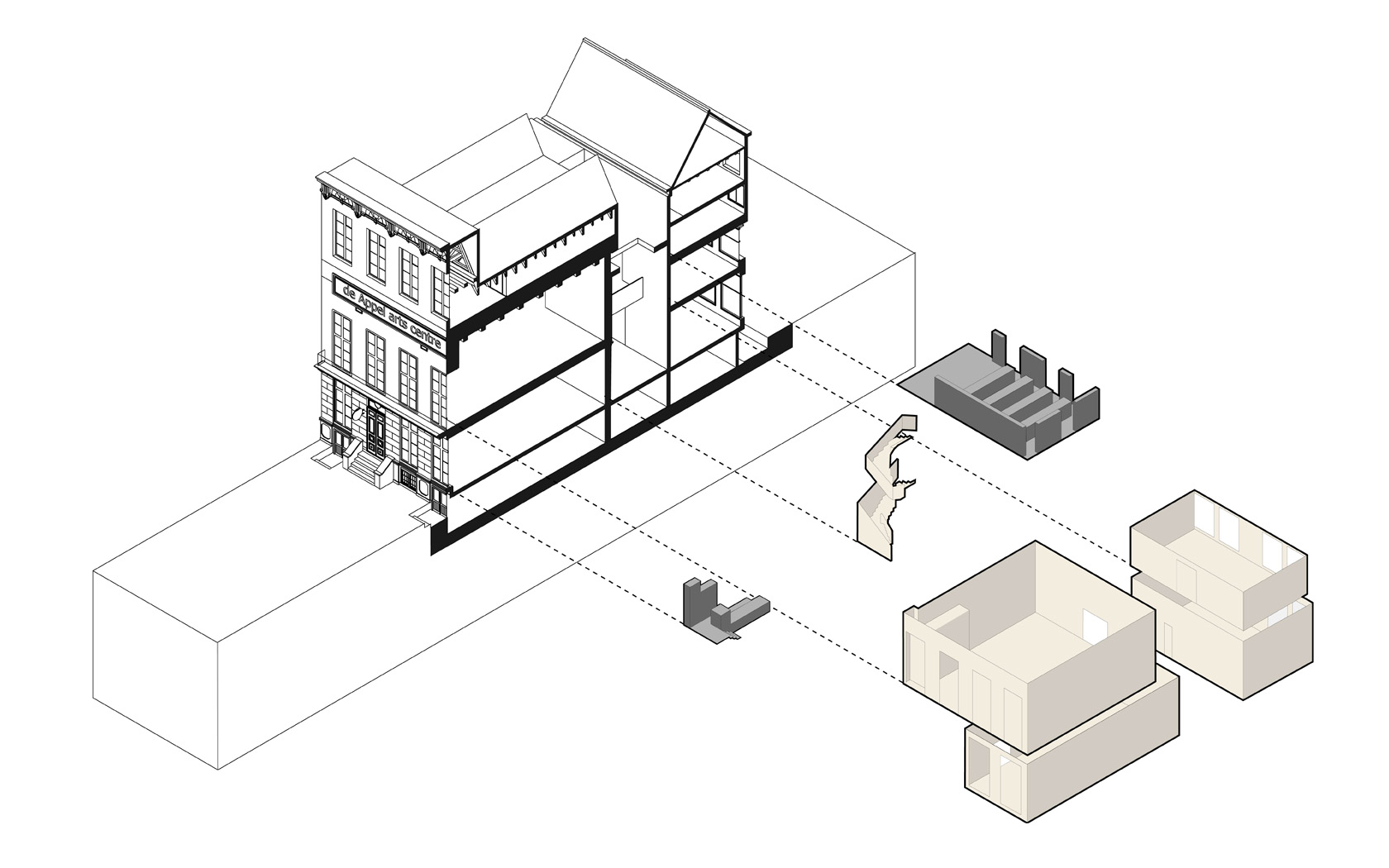
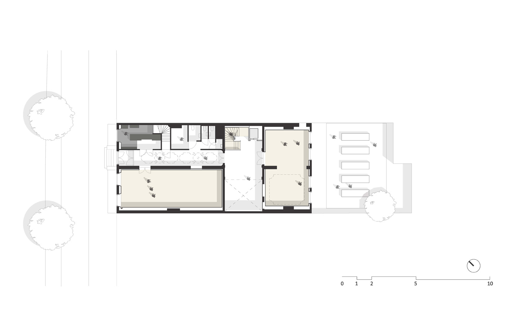
The hunt for De Appel's new home ended in 2008, when De Appel asked young design firm denieuwegeneratie to discuss their possible new locations. It ended at Prins Hendrikkade 142, former Captain's Club Zeeman's Hoop, ex meditation centre De Kosmos and previously The National Pop Music Institute. The spatial puzzle of De Appel's demands within the building's existing structure fitted almost perfectly. The exhibition spaces were placed on the ground and first floor, with the larger hall overlooking the IJ. Library,staff spaces and Curatorial Program were placed on the upper attics.The design task to make the monumental building suited for contemporary art was therefore based on 2 very functional demands. The first challenge rose on how allow De Appel's activities, which consist in a wide scope of media and is permanently changing, within a shell which had been abused throughout its previous lives and was in a very bad condition.
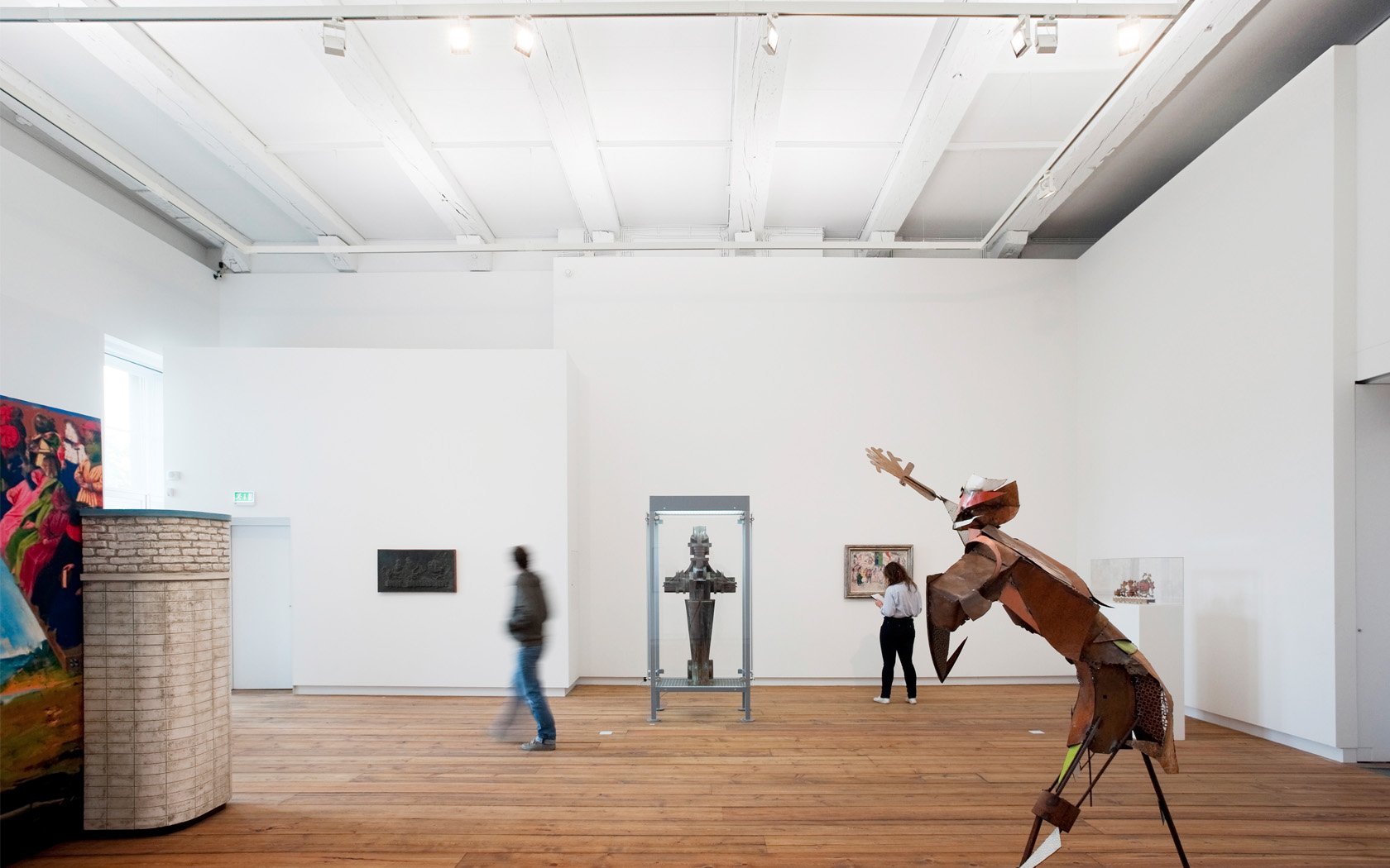
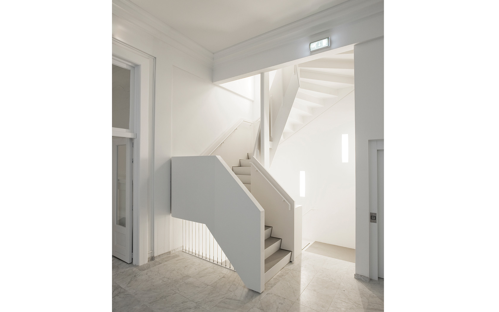
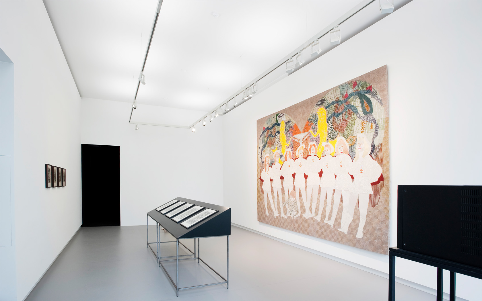
We decided to add a new layer, an inner skin placed within the monumental walls. They do not only offer exhibition surfaces that can be drilled, painted and restored easily, but protected the monumental walls at the same time. They can be taken out easily if the building evolves to a new life after De Appel, but the monument stays intact. At the same time, they tell the story of the building as a Babushka, accepting new layers every time the owner or function changes. De Appel just added a future archaeological layer. The second task, improving the building's circulation, was a more violent operation. The collection of smaller scattered staircasess and hallways were replaced with one clear gesture. A new staircase linking all floors together with a new elevator. The new steel element became an extreme complex three-dimensional sculpture. Completely designed in three-dimensional computer software, the contractor hoisted in the stairs in a tour-de-force depending on millimeters.
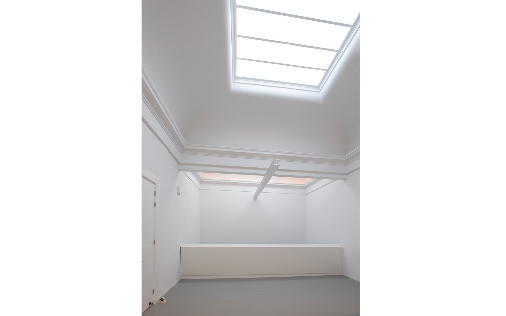
The interior finishing throughout the building were left quite basic, allowing for the stairs to be enhanced. The steel base is clad with Corian, a material with a monolithic feel and soft touch. The sculptural shape of the white, massive finishing differentiates in the foyers, to become a speech platform and reading bar. Thanks to the new circulation, the old latrge stairs have been taken out and a new void appeared, in the space of the old courtyard between the front and the back house. This gave De Appel an extra, unexpected, double height exhibition space for free. Its position in the centre of the building on both the ground and first floor turned the void into the heart of the new building: whenever roaming around, one will always pass and return to this space.
Finally, within this basic shell, 3 places were enhanced with an interior differentiation: the reception, the library and the offices all received added fixed furnishing made out of wooden plates in three colors: black,grey and blank. The reception desk has been built as a Chinese puzzle, with 196 CNC milled pieces out of 24 plates put together to form the reception desk and book shop. With these minimal, functional operations and the new, extra exhibition void, the new Appel Arts Centre was transformed. Mainly due to this extreme focused, almost surgical transformation, the construction time and finances spent were relatively low, an austere and humble attitude - realism - that fits the current context of culture in The Netherlands. This is proof that there is no need for iconic new building for cultural life to florish; that there is value in reuse. Not juist the bricks, but also the building's identity.
